Interfaces peoplereach for withoutthinking about it.
We start with the user’s actual problem and end with the screen they do not need to think about. Research, prototypes, design systems, and the careful documentation that keeps the work consistent after we have left the room.


Four practices, one design team.
UX research
We uncover what users actually need — not what they say they want — through research methods that surface real behaviour and pain points.
- User interviews & surveys
- Jobs-to-be-done mapping
- Competitive analysis
- Analytics & heatmap review
- Persona & journey mapping
- Opportunity scoring
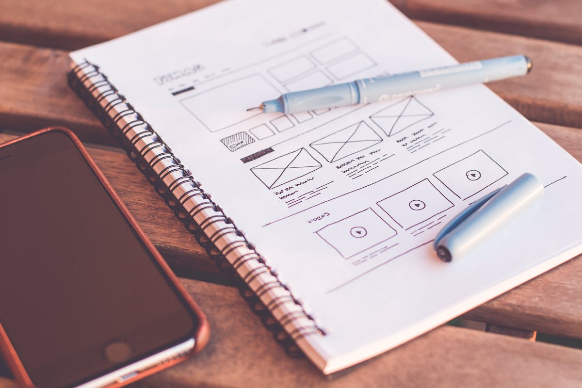
Wireframes & prototypes
Low-fidelity flows validated with real users before a pixel of final UI is produced. Speed and confidence at every stage.
- Information architecture
- Low-fi wireframes
- Interactive Figma prototypes
- User-testing sessions
- Rapid iteration cycles
- Stakeholder walkthroughs
UI design
Pixel-perfect interfaces built on a tokenised design system — so every screen feels intentional and every component ships clean.
- Visual design direction
- Component library (Figma)
- Design token architecture
- Responsive breakpoints
- Dark mode & themes
- Micro-interaction specs
Design operations
We don't throw specs over a wall. We work alongside engineering to ensure every design intention survives the build.
- Dev-ready Figma annotations
- Design QA in staging
- Accessibility audits (WCAG 2.2)
- Design system documentation
- Component naming conventions
- Ongoing design retainers
Problems we solve.
SaaS product redesign
End-to-end redesign of complex dashboards and workflows to increase activation and reduce churn.
Mobile app onboarding
Onboarding flows that guide users to their first "aha moment" without friction or confusion.
Design system build
A tokenised component library in Figma and React that keeps design and code in sync at scale.
E-commerce checkout
Streamlined purchase flows that cut abandonment and lift conversion with evidence-based design.
Dashboard & data viz
Complex data made legible — charts, tables, and filters that analysts actually enjoy using.
Brand-new startup UI
From blank canvas to launch-ready product UI in weeks, not months.
Our design toolkit.
We pick the right tool for each job — not the one we're most comfortable with.